How to Make Your B2B Website More User-friendly

Every single business-to-business (B2B) website is developed to achieve one (or all) of the following goals: to make a sale, to generate a lead, and to attract the right kind of web traffic. One way to create the perfect B2B website is by ensuring its user-friendliness. A ‘user-friendly’ website can be easily accessed and navigated by all possible online visitors and across different devices. It involves experts familiar with both flexible layouts and with the requirements of optimal website design and functionality. The core objective must be to significantly improve the user experience, whether they access the website via a laptop computer or a mobile device. Make sure that after you have implemented the following strategies, you follow up with the right user experience tests to ensure that your online experience is as expected.
Make It Responsive

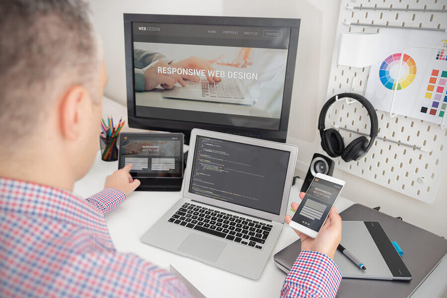
You will want to make sure that no matter which platform your visitors are using, whether that is a mobile, a tablet, a desktop, or any other related device, you have your website optimized for each and every platform. Responsive website design is a method through which website developers can ensure a seamless user experience, despite the website being viewed from different devices and platforms. Often, a website that seems perfect on your laptop or desktop becomes a mess when using it on your mobile or tablet. Banners are floating off the page, the text is not properly aligned, and other similar issues- all of which can negatively affect your user experience. This can also negatively impact your business’s reputation. A cluttered website that lacks responsiveness implies that the business possesses an unprofessional attitude. Most of your potential customers already conduct their initial research themselves, often by searching for a company’s website or social media handle through a simple search engine query. The world’s most powerful search engine, Google, now also considers “mobile-friendliness” or responsiveness while ranking websites for their relevance and utility.
User-friendly Website Navigation

After committing to responsive website design, the next step is evaluating how easy (or complex) it is to navigate the website itself. In order to create an optimal user experience on the website, you must ensure that the website design is easy to use and functional. Ideally, the navigation options should eliminate as many steps as possible between a website visitor’s quest, say for a particular product, and the page with further details about the product – including how to buy it!
Website design experts recommend starting with a basic sitemap or a website menu and building the navigational flow from there. Online visitors should be able to figure out where a button leads without even clicking the link. For this reason alone, it is recommended that developers should avoid using obscure or industry-specific jargon in the menu or pages section. If you still feel there is a need for an alternative definition or title for a webpage, this can be accomplished by using temporary pop-up notifications or parallel landing pages for newsletter subscribers. Some of the popular primary navigation styles include:
- Top-Centred Navigation: With this placement, the online visitor gets a comprehensive “birds-eye” view of what the website has to offer.
- Left-Hand and Right-hand Sidebar Navigation: This type of “navbar” (or navigation bar) aligns the main menu along the left-hand or right-hand side of the screen. This particular layout works well on mobile devices and is often designed with an expandable “hamburger” menu widget.
- Vertical Sliding Navigation: In this design, some creatives chose to add icons to represent key pages on the website, such as the home symbol for the home page or a calendar symbol for events.
- Hamburger Menu: It is perhaps the most mobile-friendly navigation menu in use these days. This is often used in combination with other types of navigation bars, including top-centered and left or right-hand side.
- Ultra-Wide Drop-Down Menu: This type of drop-down menu includes multiple columns that keep expanding as one scrolls down or across. It is popularly used for magazine-style websites.
- Sticky Navigation Bar: As a rule, sticky navbars are recommended for use on e-commerce and retail websites; essentially where you want the visitor to take a certain action.
- Top Story Carousels: This type of navigational menu is commonly found on high-profile news websites like the New York Times.
Remember: no matter which type of navigation you end up choosing, the main logo must contain a link back to the homepage. Along with this detail, make sure that the overall design of your website and its navigation are both easily readable. A readability assessment evaluates the font type, all the images being used, space management as well and other elements that enhance the website’s visual appeal.
Contact Information

Whether your business sells exotic plants or custom-printed greeting cards, the key contact information should be easily accessible for the website visitors. Whether that be in the form of a contact number, an email address, links to social media accounts or pre-set Google Map directions, they must all be clearly conveyed to the visitor. Generally, the most convenient spot to place contact details is within the website’s footer navigation bar.
Incorporating a Live Chat Solution

One way to drastically improve your website’s user experience is by investing in a live chat service. According to a study by eDigital Research, Customer Service Benchmark, out of all the customer support channels available live chat currently provides the highest satisfaction level. Any questions or concerns a prospective customer has can be easily asked and answered – with a click of a button. Online visitors can choose to interact with the live chat agent when required. Other usual barriers to customer service, such as office timings and limited human resources, are covered by standard features such as 24/7 online assistance and multilingual support.
Value-Added Content

You can make your website stand out by curating and publishing the right-type of content. It all begins with creating and publishing relevant, jargon-free content that covers innovative, industry-relevant topics and provides your readers with actionable insights as well as insider information. Each article or video must address common challenges or ‘pain points’ that impact the target customer’s day-to-day business. To establish true thought leadership, each highlighted challenge must be matched with a well-researched solution or strategy. Here are some popular formats through which your organization can engage with prospective customers:
- Brochures
- Infographics
- Whitepapers
- Instructional Videos
- Case Studies
- Flyers
- E-Books
Note: the content’s utility for the visitor should be obvious from the introductory paragraph or within the first few seconds of an instructional video.
Faster Load Times

A website’s performance is ultimately judged by its loading time. The optimal loading time is three to four seconds while anywhere under nine seconds is considered an acceptable loading time for a webpage. Nowadays, website visitors only wait for a few seconds for websites to load so it is important your loading times are up to the mark. According to Google, more than 50% of all website visitors “bounce” or leave after three seconds. Slow load times are often the result of too many plugins on the website itself. These third-party plugins usually provide website tracking analytics or host social media accounts within widgets.
Your website is a reflection of your business. It must communicate the company’s values, facilitate all online visitors, and most importantly, highlight your products and services. These are some of the tried-and-tested methods which result in a positive experience for possible website visitors. Starting with the website navigation, you must also provide an easy-to-locate search functionality as well as publish content that delivers real value to the online visitor. It is only when all the features combine, the functional aspects and the aesthetically pleasing ones, that the outcome is a user-friendly website.

